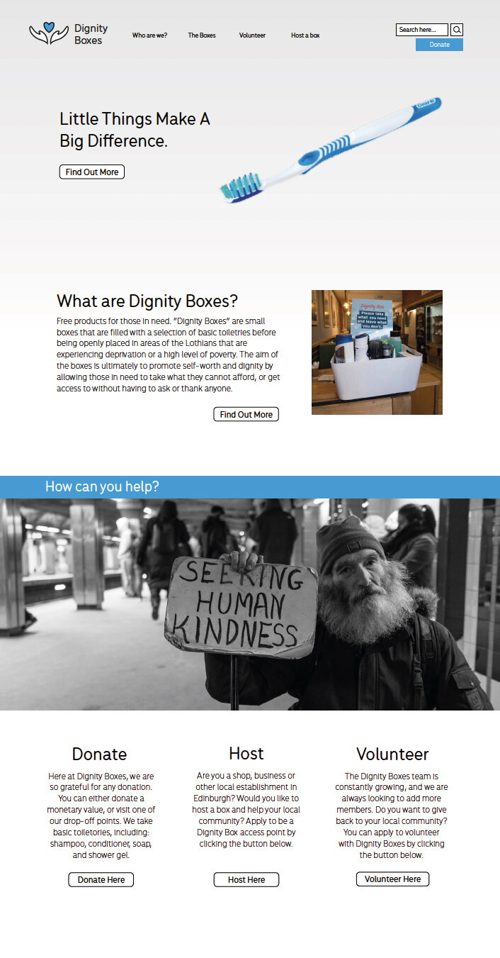
Dignity Boxes
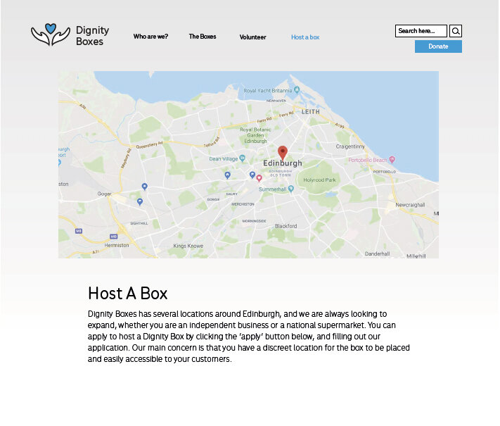
‘Dignity Boxes’ is a charitable organisation that collects donations of basic toiletries to be placed in specific locations, for those living in poverty or areas of deprivation. Our university tasked us with creating a new brand for the charity, including a logo, box design, website, feedback card and more.
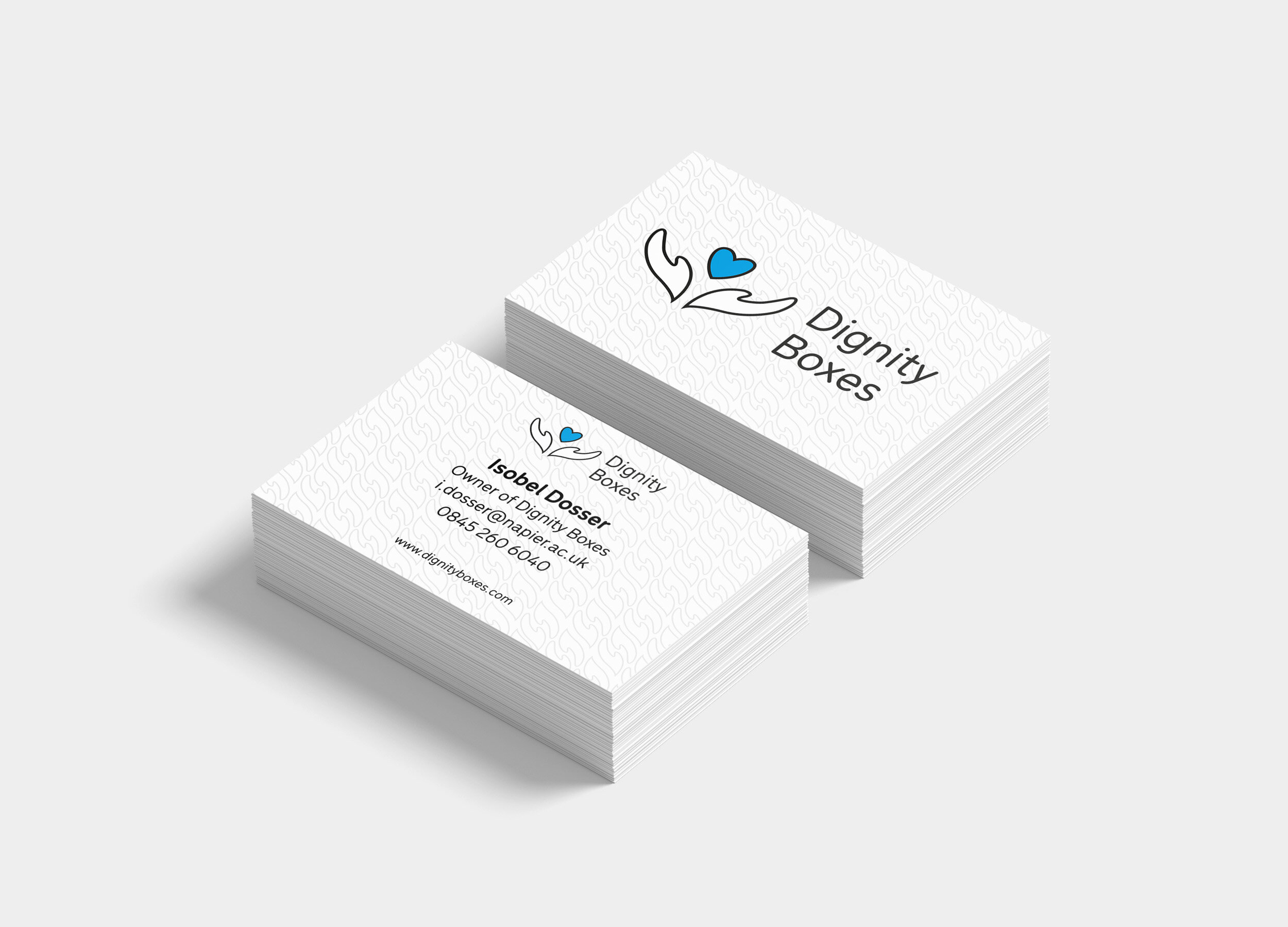
(Left) business card displaying logo, contact info and subtle use of pattern.
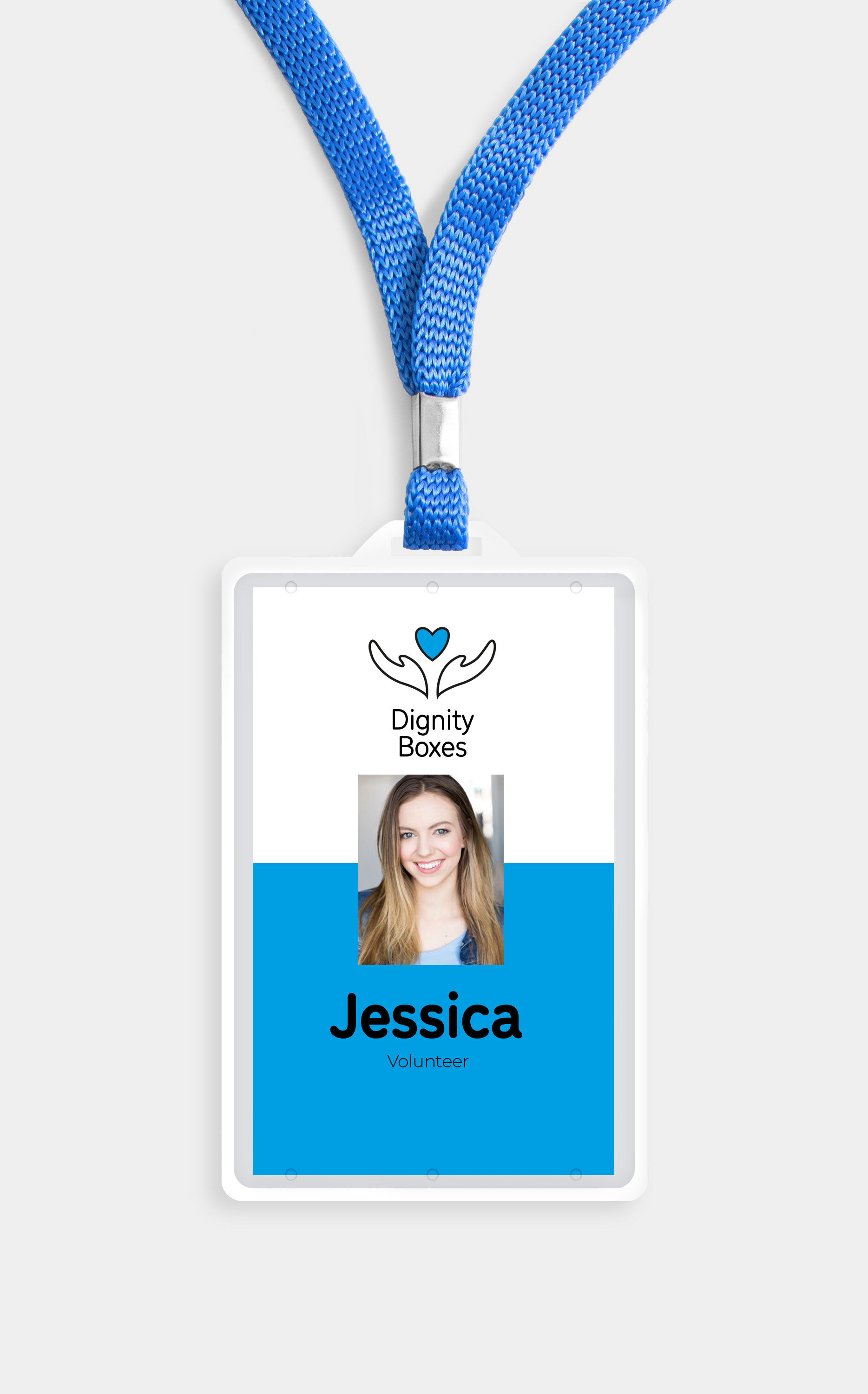
(Above) example of an employee badge using the branding style.
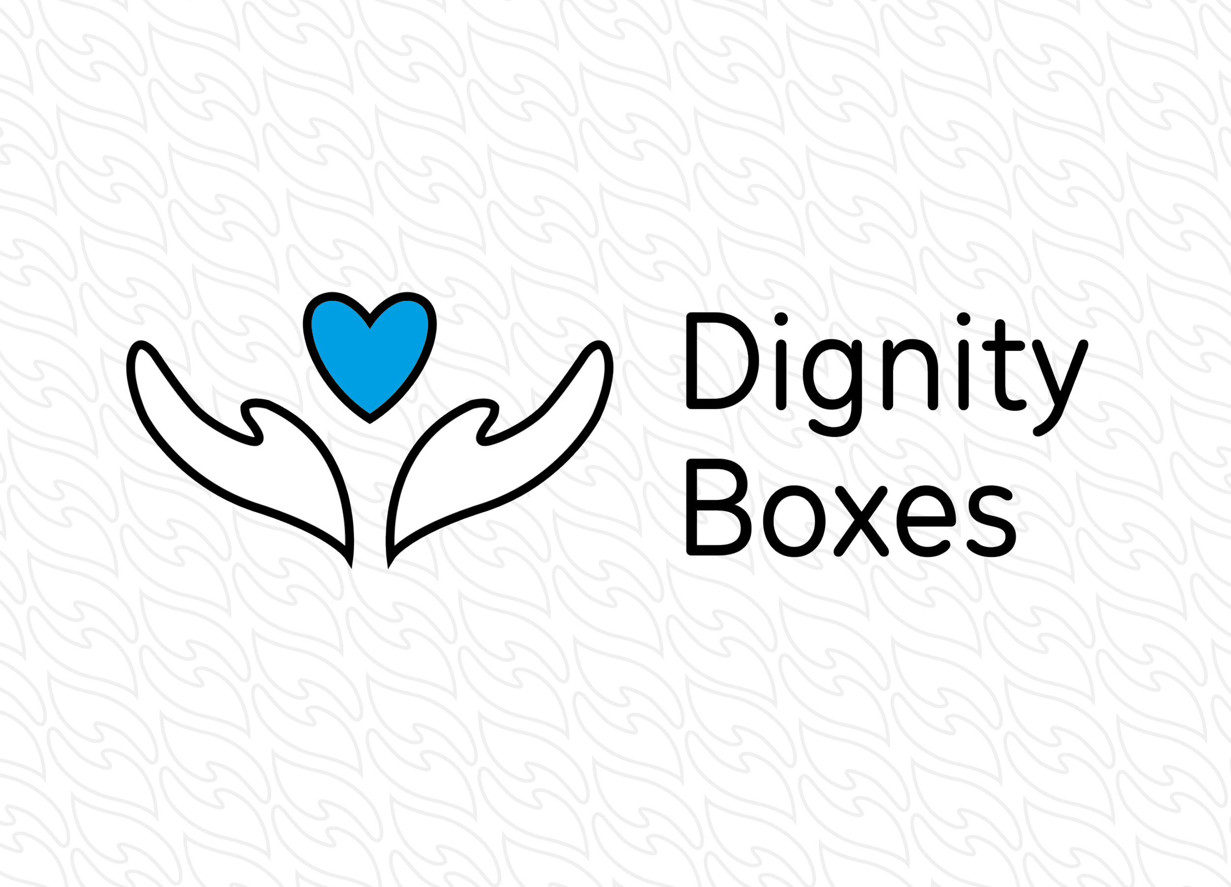
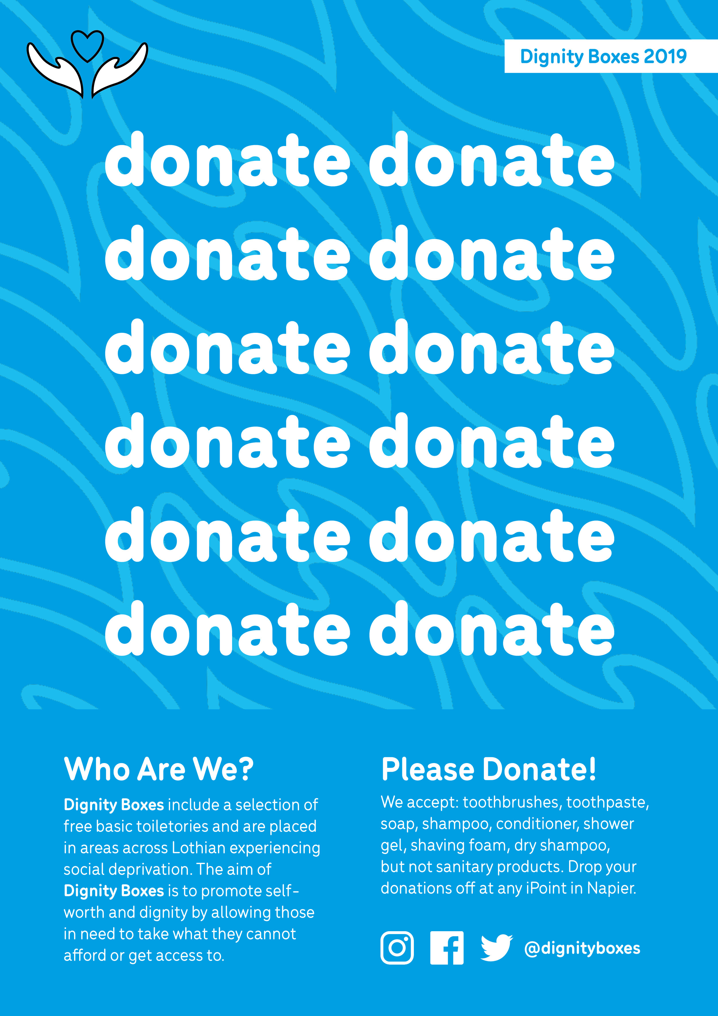
My logo shows outstretched hands offering a heart. This is linked to giving, compassion and a welcoming tone of voice. The shape of the logo is reminiscent of a thistle, linking it to the charity being Scotland-based. Blue is a calm colour and also links further to Scotland.
From the logo, I created a dynamic pattern that could be used for many different applications. I took the hands from the logo that are outstretched, and arranged them so that they are held out to another hand (giving a ‘helping hand’).


Graphic design students were paired up with Product Design students, who had individually created new ideas for the design of the actual box. Our task was to apply the graphics.

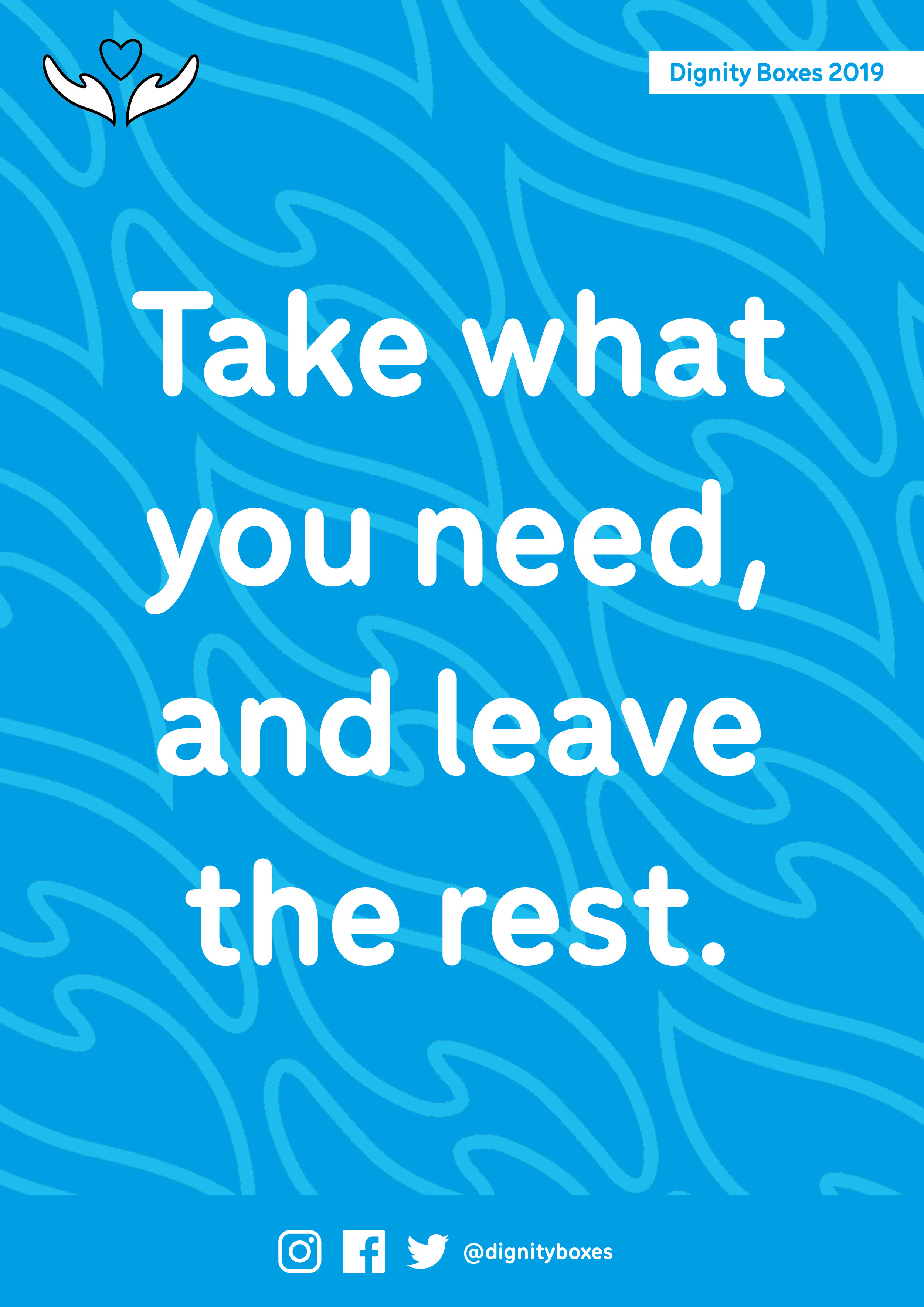
Finally, we were asked to design an easy to use feedback card where users could supply anonymous feedback about the Dignity Boxes.